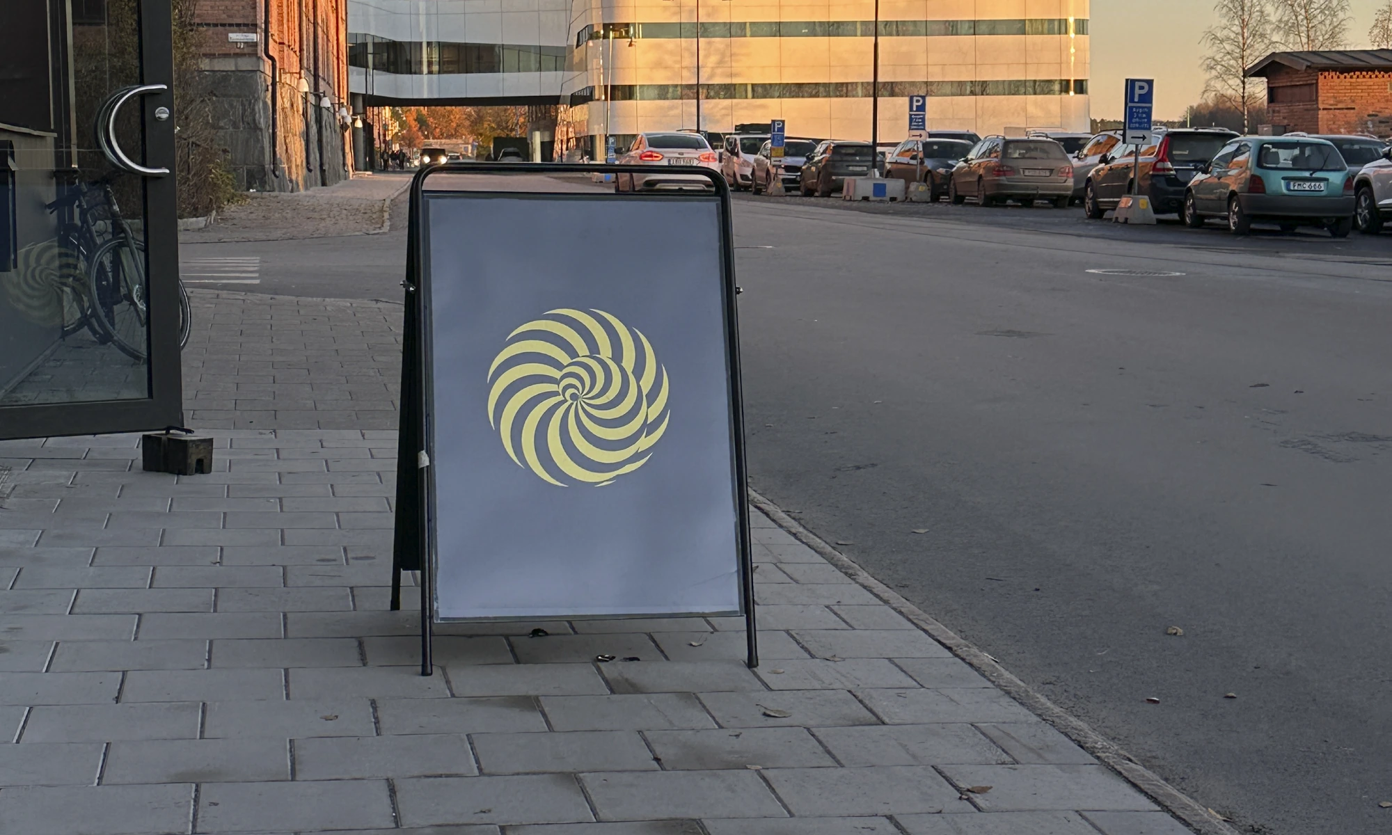
Visual identity for a lecture series initiated by the Interior Architecture department at Konstfack University in Stockholm. The work is developed along side a artistic research project called Instructions for letters, letters for instruction
project: visual identity
year: 2025
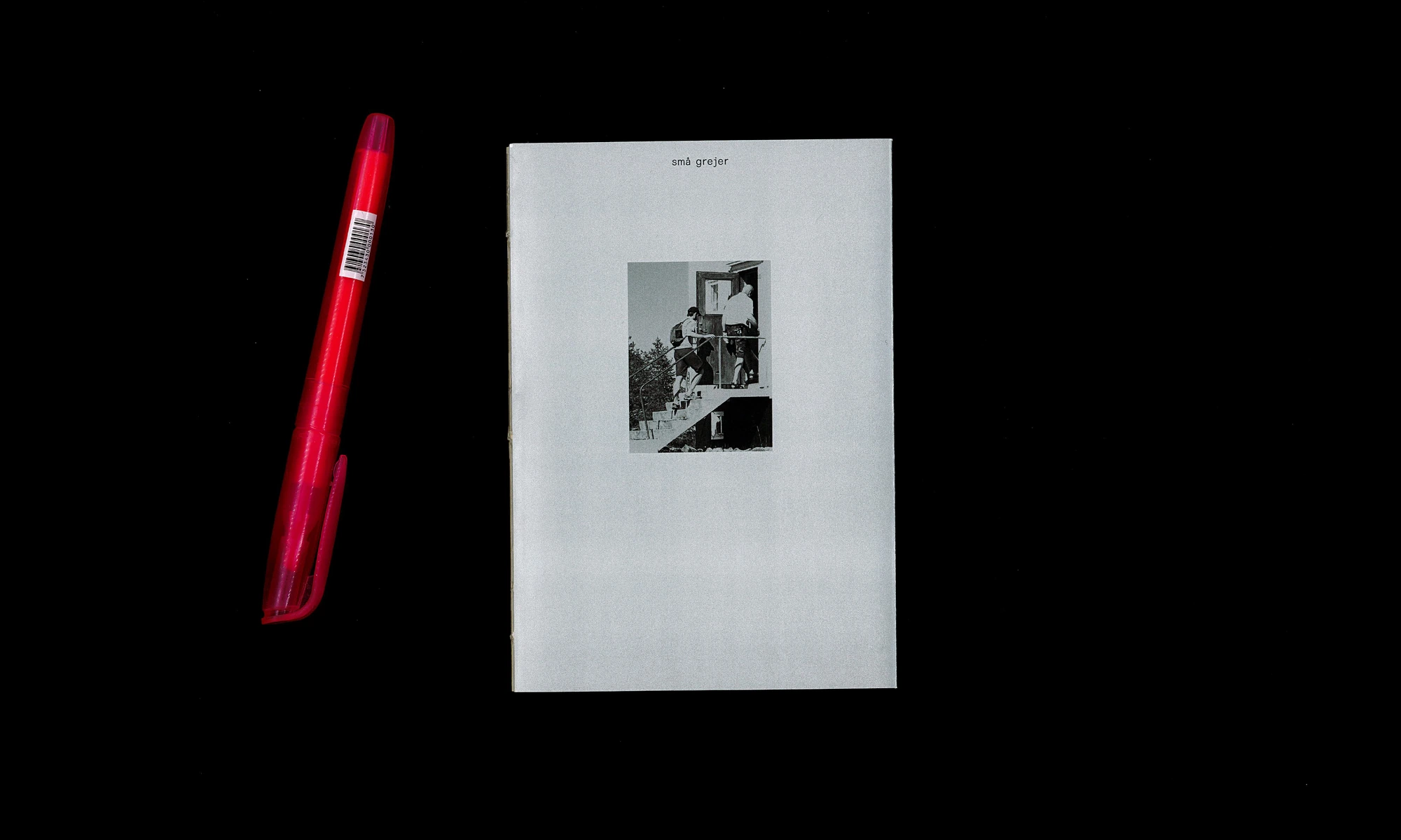
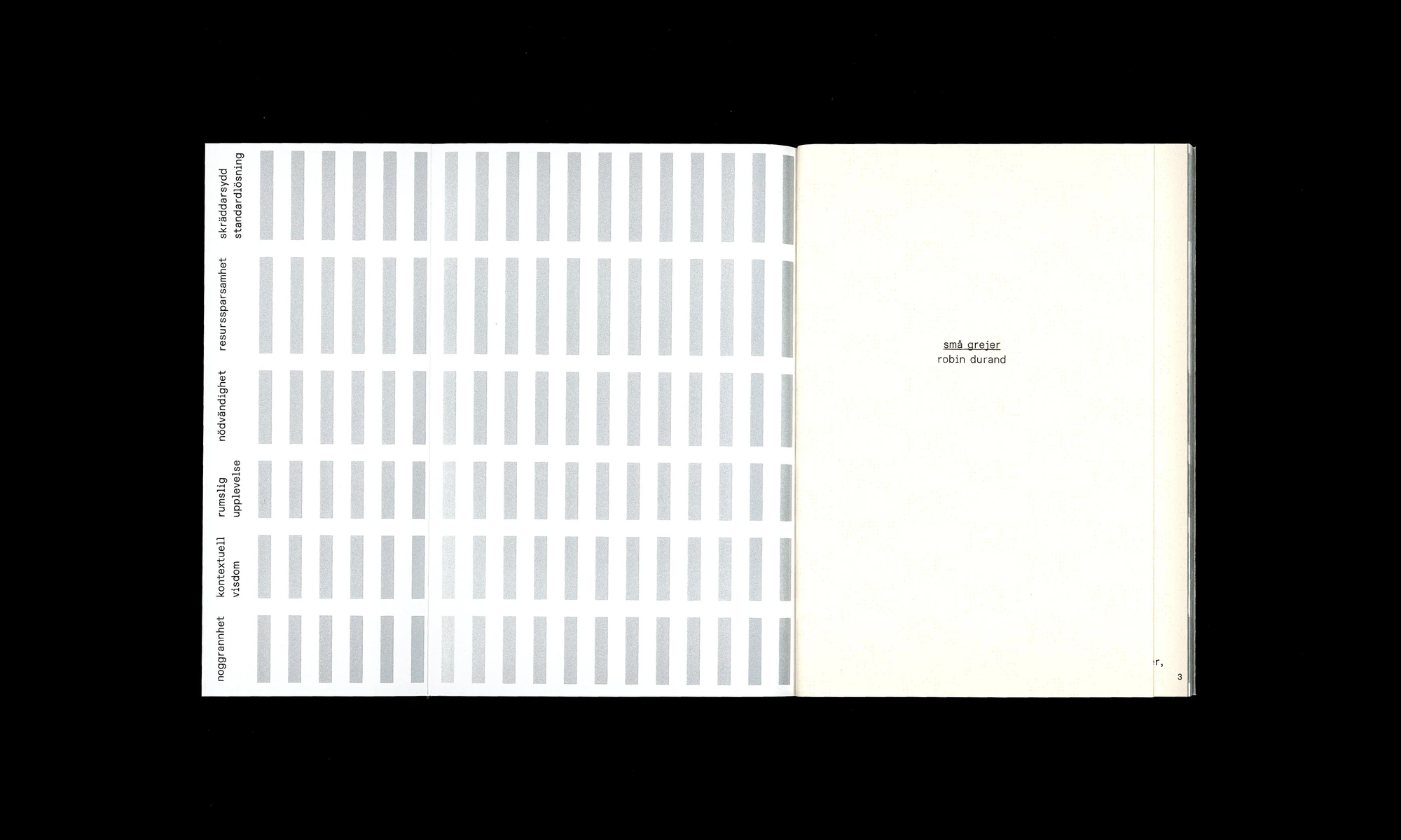
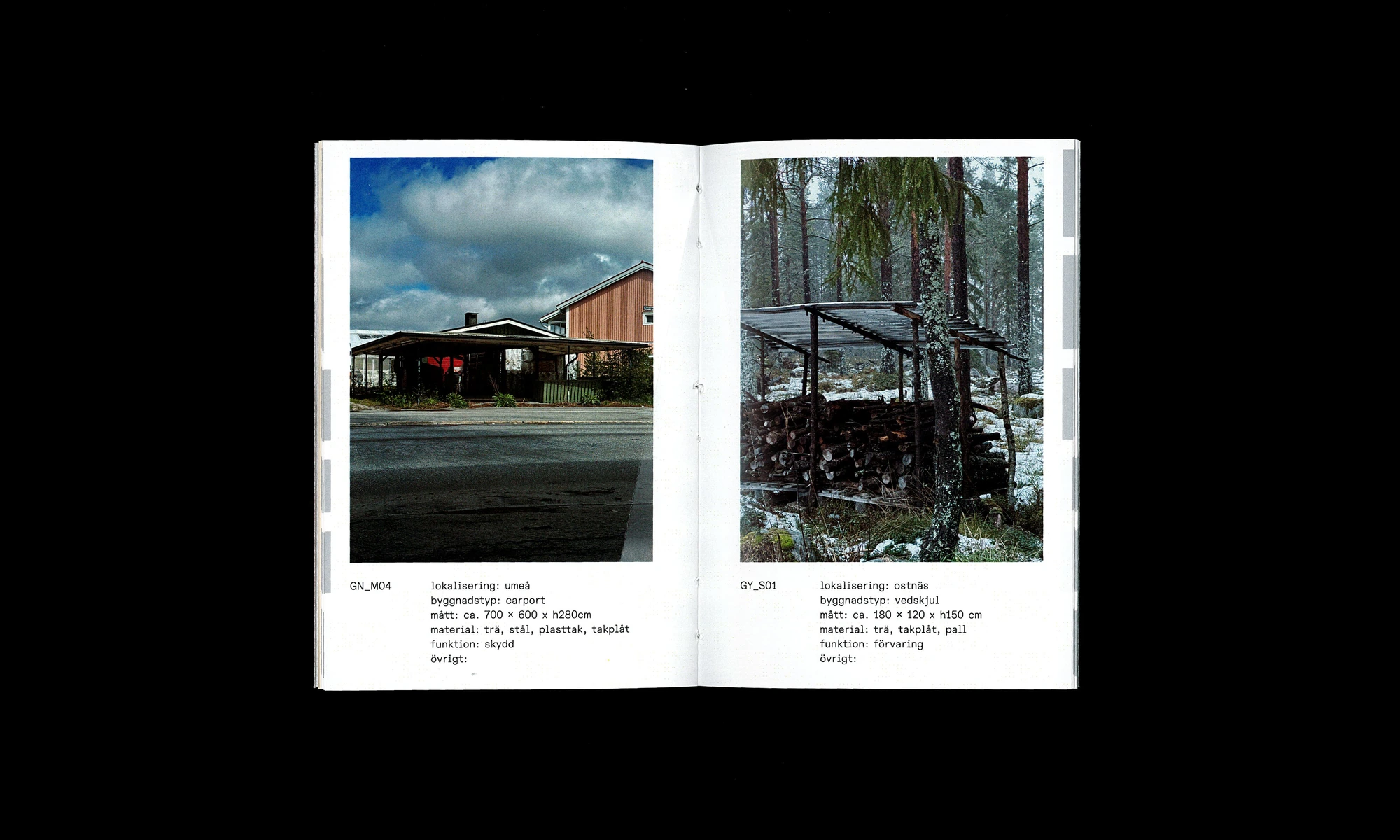
Research project Små Grejer (Little Things) is a pocket architecture guide to Umeå Kommun which gathers together a collection of hybridized buildings where modifications intentionally made by its users transform the symbolic value of the architecture.
Project: Publication design
Year: 2025
Research: Robin Durand
Graphic Design: Sirka
Print: Orginal Tryckeri, Umeå
Typeface: ABC Dinamo Diatype Rounded Semi Mono
Visual identity for Pom Friterie designed in conversation with Jonas Williamson. The visual identity included logo, colors, typography, menus and website which also was developed by us.
Project: Visual identity
year: 2023
typeface: PX Grotesk, PX Grotesk Mono by Optimo
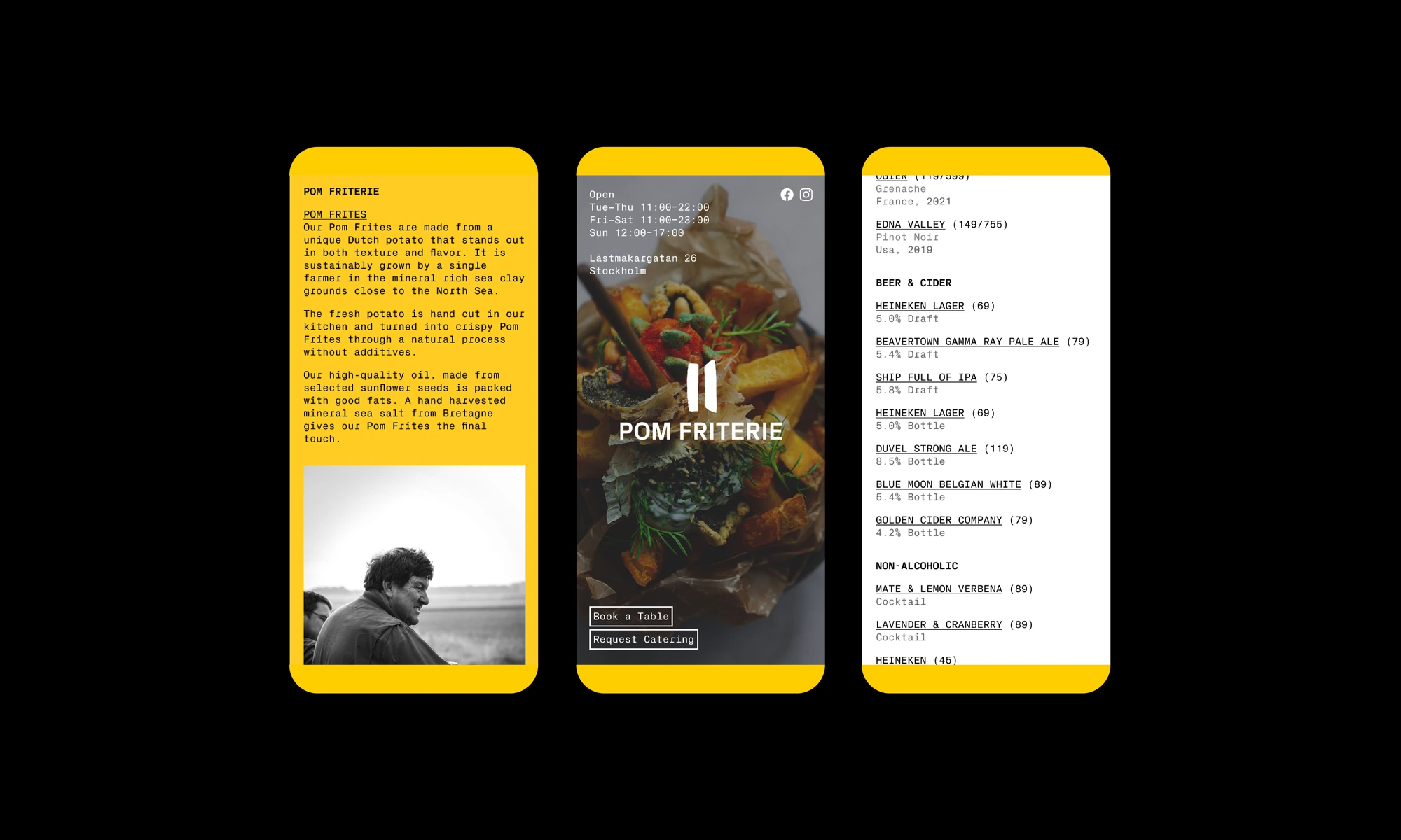
Visual identity for Pom Friterie designed in conversation with Jonas Williamson. The visual identity included logo, colors, typography, menus and website which also was developed by us.
Project: Visual identity
year: 2023
typeface: PX Grotesk, PX Grotesk Mono by Optimo
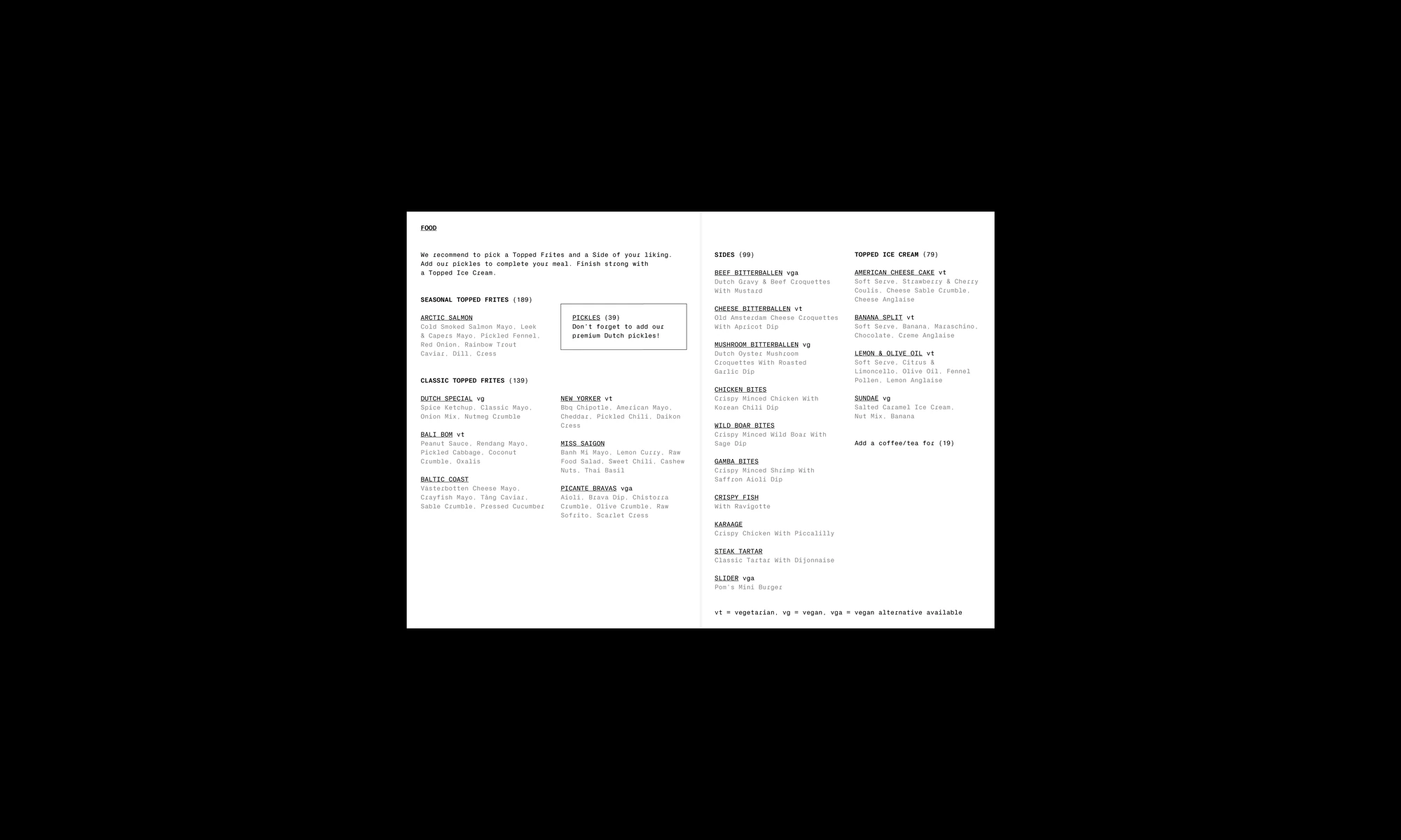
Visual identity for Pom Friterie designed in conversation with Jonas Williamson. The visual identity included logo, colors, typography, menus and website which also was developed by us.
Project: Visual identity
year: 2023
typeface: PX Grotesk, PX Grotesk Mono by Optimo
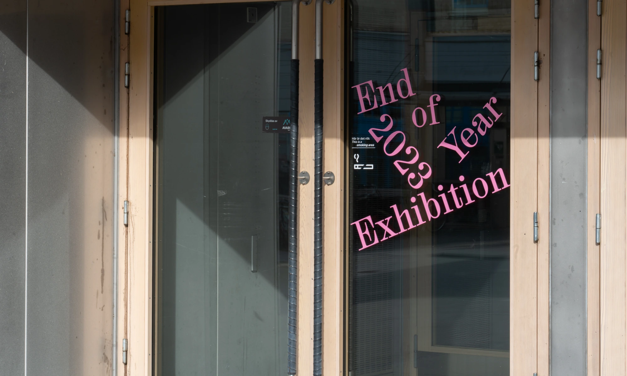
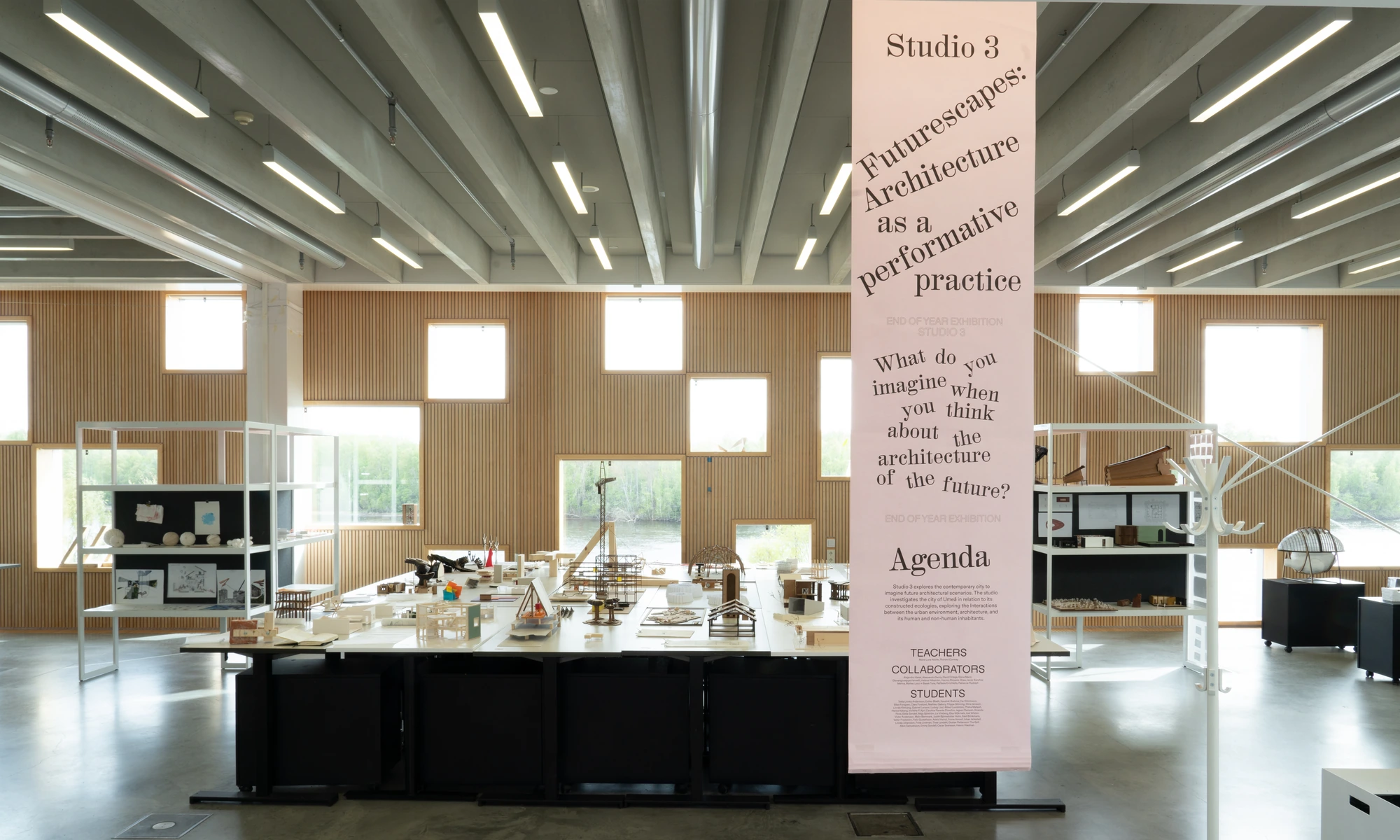
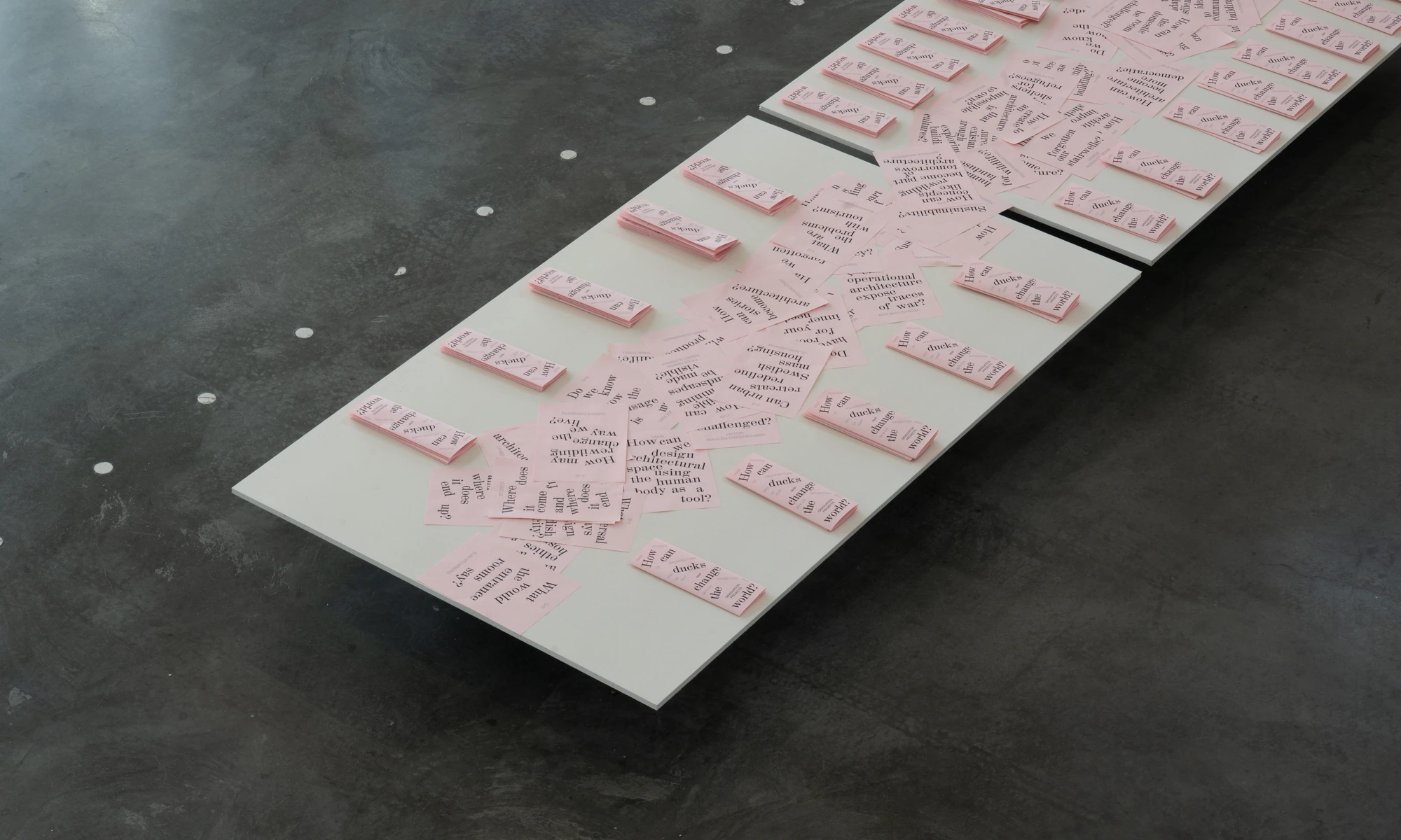
visual identity for the UMA 2023 End of Year Exhibition, rather than presenting the ”end of year exhibition“ on the posters, the concept uses the students’ own questions as the central design element, with the ambition of inviting curiosity and engagement from the visitors. all print materials were produced in-house, and physical display elements were built in the school’s own workshop. a distinctive highlight is the use of pink drafting paper, traditionally reserved for colour coded electrical plans.
Project: Visual identity
year: 2023
Exhibition team: Sirka, Maxine Lundström and Robin Durand
Photo: Jonas Eltes
Typeface: Colant by Hanzer liccini and Karl by Source Type
Exhibition identity based on a bespoke typeface made by us for Rörelser at Borlänge Modern organized by KiD – Art in Dalarna.
Olle Norås (artist), and Sara Rossling (curator) was given the task of selecting three artists to exhibit in the former Borlänge Modern premises. The jury chose Elina Birkehag, Erika Nordqvist, and Kristin Ylikiiskilä Broberg. All three artists have connections to Dalarna and work in different media such as spatial installations, drawing, essay, and video art. Together they created the exhibition Rörelser (“Movements”), which took place in September 2022.
Elina Birkehag grew up in Grycksbo and Östbjörka. She holds a Master’s degree in Fine Arts from the Royal Institute of Art in Stockholm.
Erika Nordqvist is an artist with a Master’s degree in Fine Arts from the Slade School of Fine Art in London. She lives and works in the village of Öja outside Rättvik.
Kristin Ylikiiskilä Broberg was born and is based in Falun. She holds a Master’s degree in Fine Arts from Konstfack.
Project: Exhibition identity
year: 2022
Animation: MoMotion
Sound design: Joel Gerhardsson
Typeface: bespoke
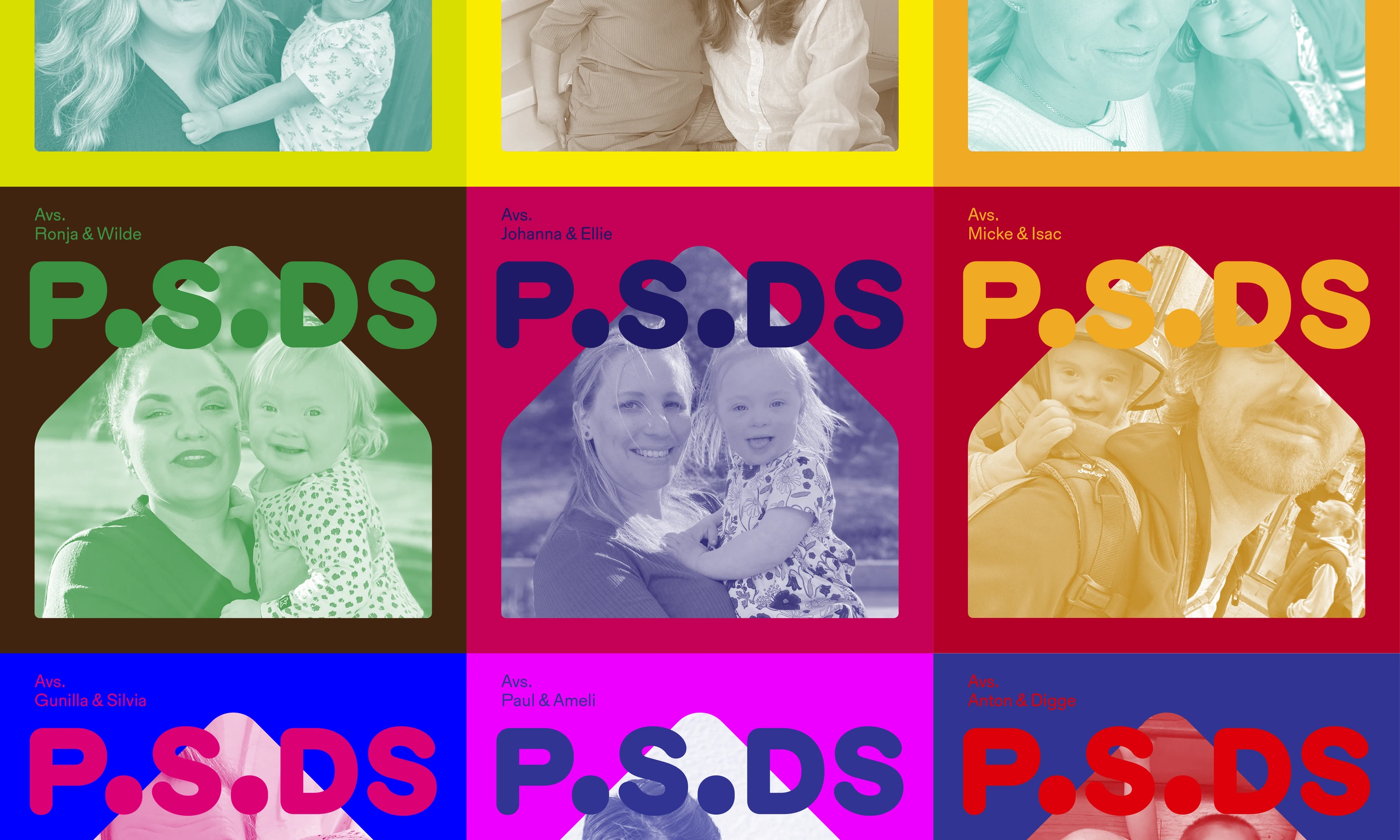
Visual identidy for P.S.DS – A Podcast About Down Syndrome and Family Life. P.S.DS is a warm and honest podcast exploring life with Down syndrome, from family life and parenting to sibling relationships and everything in between. In each episode, host Julia Beil Amarilla sits down with a mother or father of a child with Down syndrome. They share the story of the day they received the diagnosis, what they wish they had known back then, and how life has unfolded since. What were their hopes and fears? How does reality compare? Whether you’re expecting or already raising a child with that “little something extra,” or you work in healthcare and meet children with Down syndrome and their families, you’ll find stories, insights, and perspectives that will stay with you long after you listen.
We have developed a clear and recognizable visual identity. Because the podcast is about adding nuance and broadening perspectives, we decided to go against the spontaneous and clichéd idea of using just one or a few “brand colors”. Instead, we have embraced all colors, without judging which combinations are considered more “beautiful” than others. Every color is welcome, symbolizing that every person has the right to exist, to be, and to be visible in the world and in society. Since the colors vary freely, the typography, logo, and symbol remain consistent across all uses, ensuring clarity and recognition, while allowing the colors to run wild.
Project: Visual identity & art direction, social media , animation
Year: 2024
animation: MoMotion
Typeface: Karl by Source Type
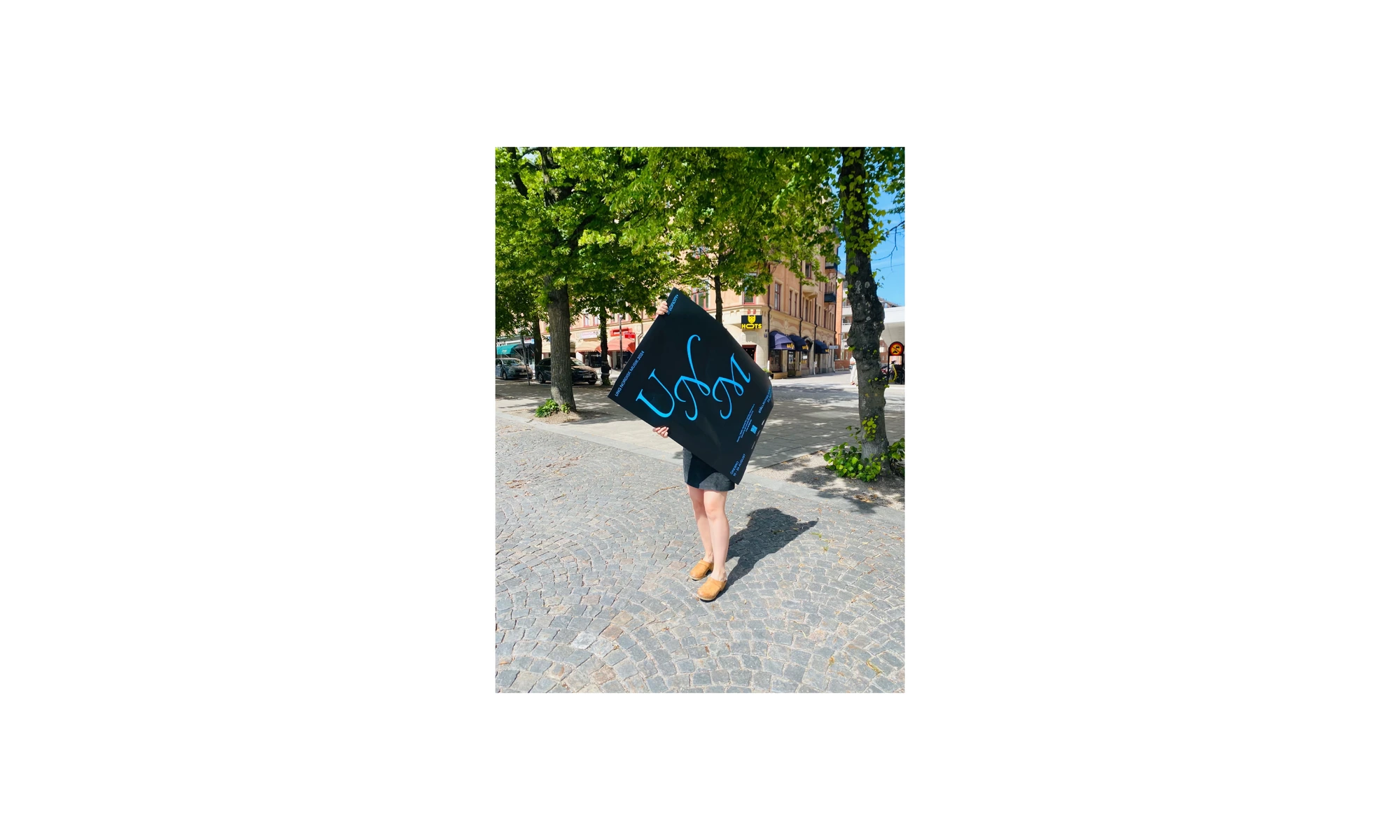
Visual identity for the 78th edition of the UNM festival in Örebro, Sweden. Ung Nordisk Musik (UNM) is a Nordic organization that annually organizes a festival for young composers (in the term 'composer' we also include sound artists and intermedia artists) under the age of 31, with connections to one of the five Nordic countries and the Baltics.
Project: Visual identity
Year: 2024
Figure for eXpression Umeå based on their iconic X. We made a variable type based on their X in order to make a number of X:es representing different people. The figure exist in various shapes and sizes and can be stacked together as a group lifting each other as a reminder of the time spent on the incubator and the spirit of helping each other
year: 2025
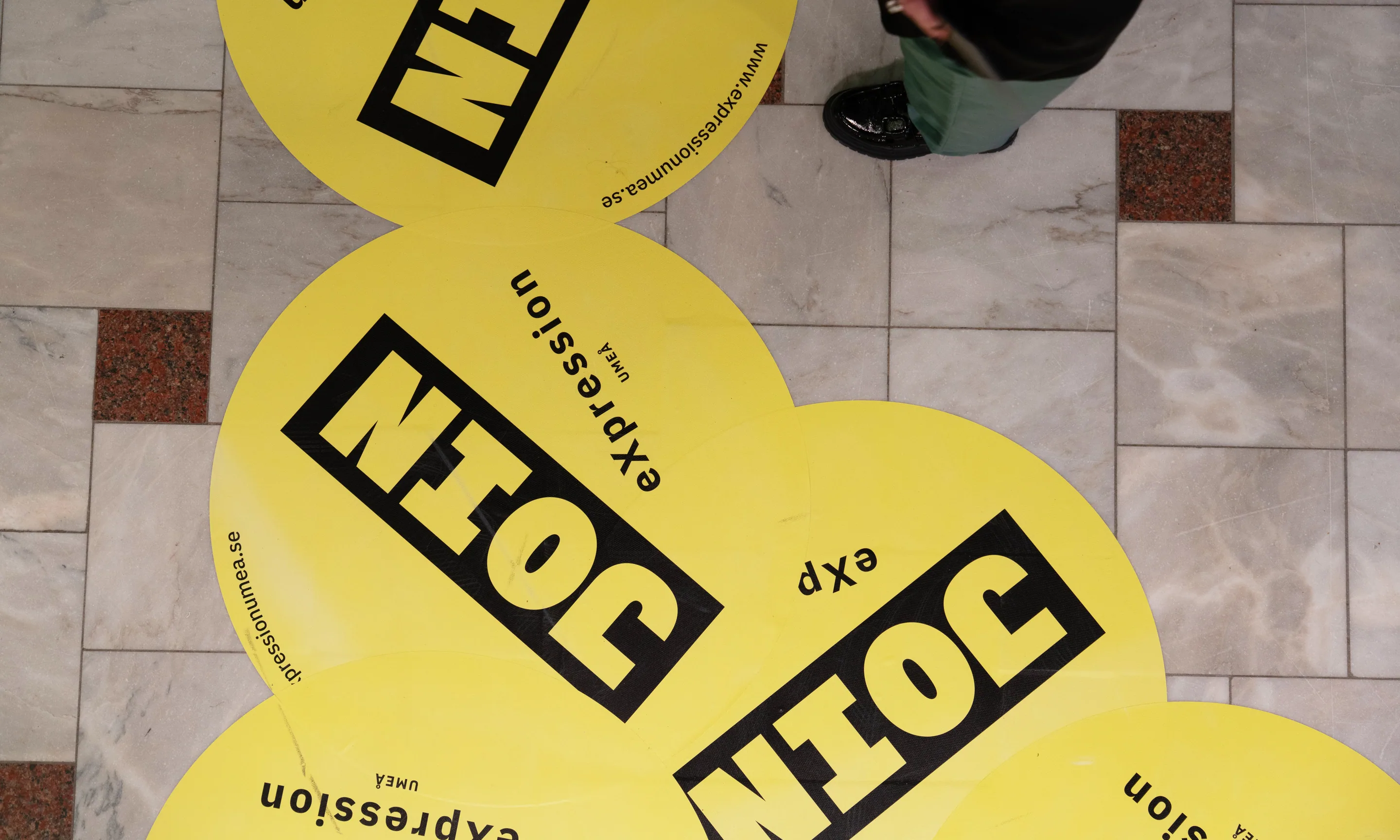
For eXpression Umeå’s campaign Join eXpression, we developed a bold and energetic visual identity that invites people to engage with the incubator and its community of creative and cultural businesses. The campaign is used for theme days where companies are highlighted, and the message is clear: join in, participate, collaborate, or discover new opportunities through the entrepreneurs at eXpression.
Building on eXpression’s existing brand, we took their recognizable circle logo and color palette as a foundation, while adding a strong display typeface reminiscent of political and activist campaigns. Its large, stencil-like letters evoke both urgency and a DIY spirit, connecting to grassroots creativity and poster-making culture. The circle itself is reimagined as a kind of sticker, placed, layered, and overlapped in a playful, almost frenetic energy.
project: visual identity
year: 2024
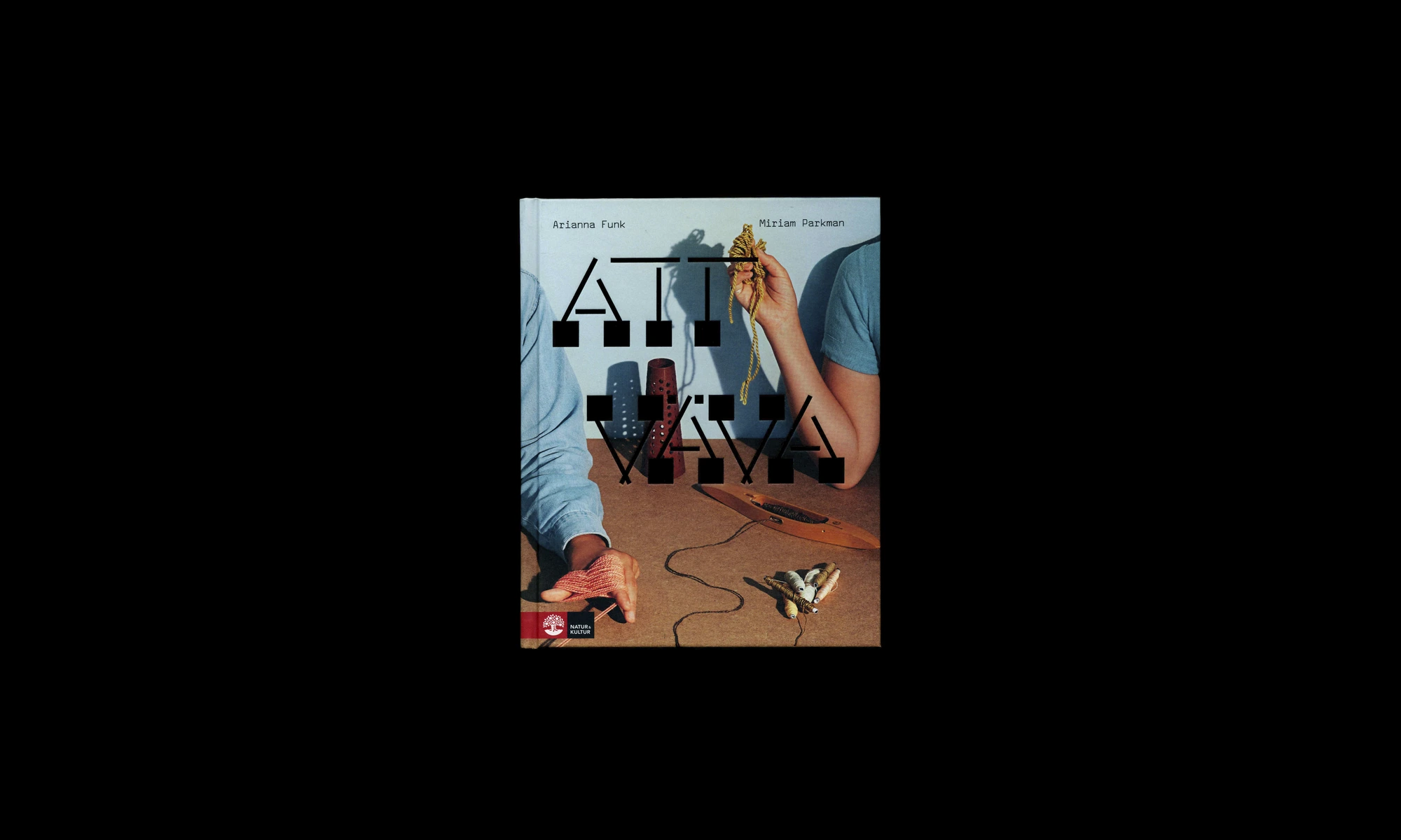
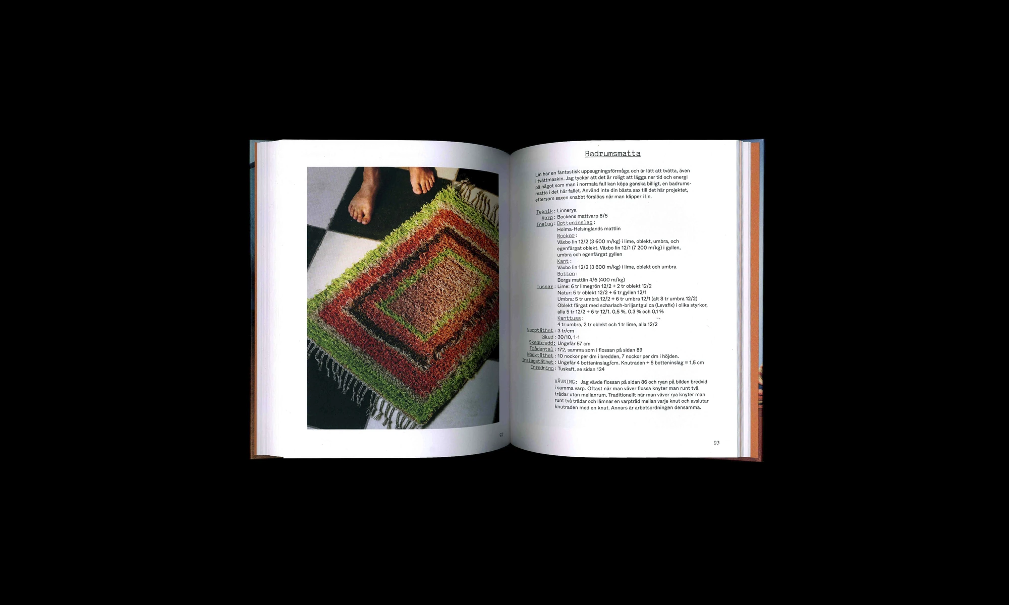
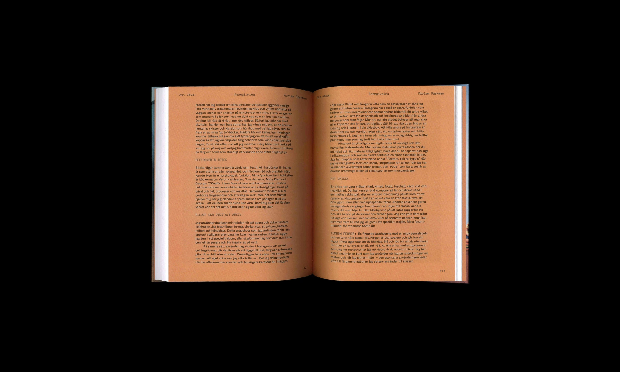
Book design for ”Att Väva, a book about weaving”. We made a a bespoke typeface with inspiration from the world of weaving and weaving drafts. In conversations with the authors Miriam Parkman and Arianna Funk it became clear that they wanted the visual language of the book to try to get away from the typical way of portraying ”women in craft”. Using the bespoke typeface our process came up with and adding a ”stencil like” quality to it made it more inline with something associated with a typical masculine world such as ”army” or so. Here used in contrast to the photography it directly talks about weaving and the topic of the book wich is full of weaving tips and weaving drafts for you to try out.
Designed in collaboration with Mikael Hultman
Project: Publication design
Authors: Arianna Funk and Miriam Parkman
size: 200 x 250 mm
Pages: 140
Format: hardcover
Language: Swedish
Editor: Elisabeth Fock
Publisher: Natur & Kultur
photo: Martina Ankarfyr
year: 2020
ISBN 13: 9789127164741
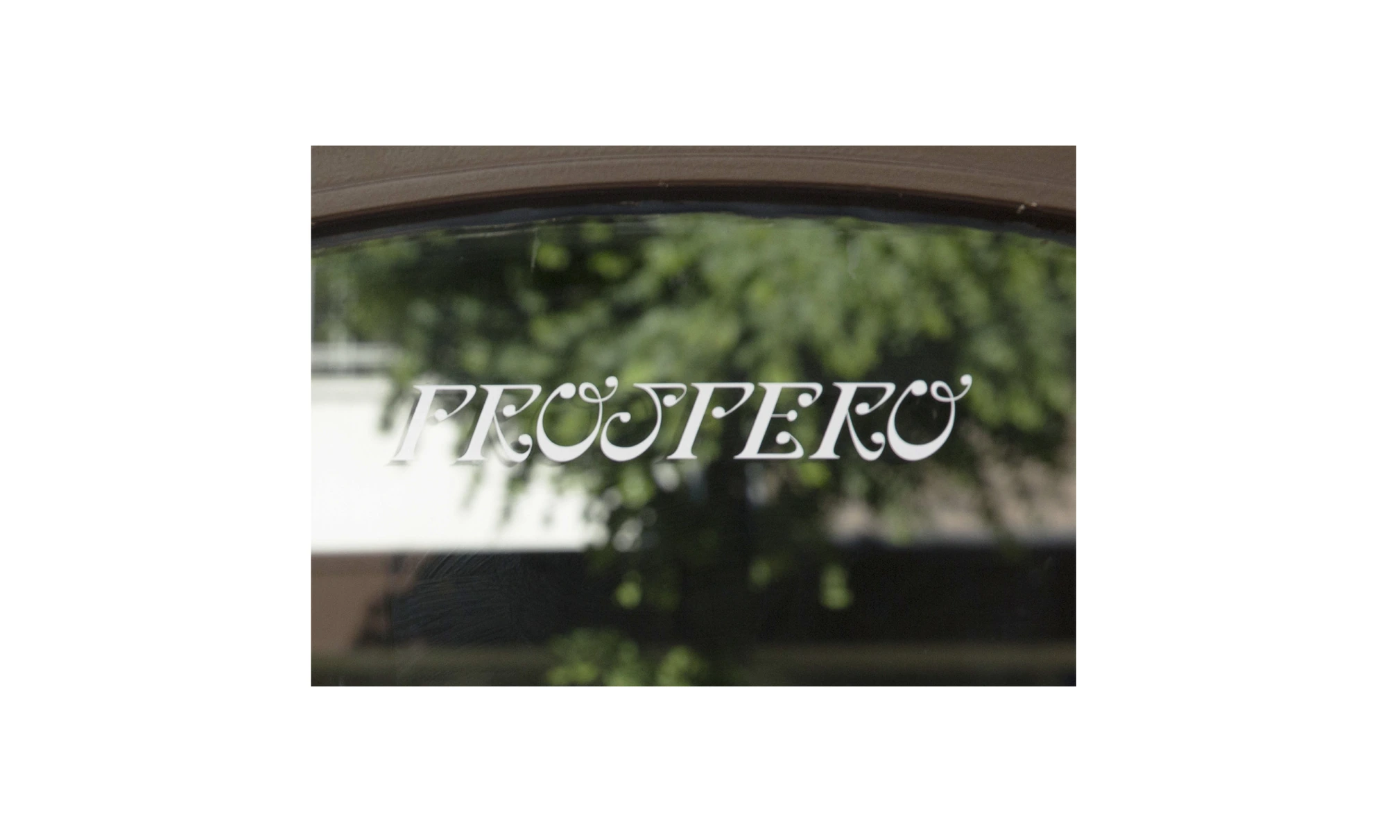
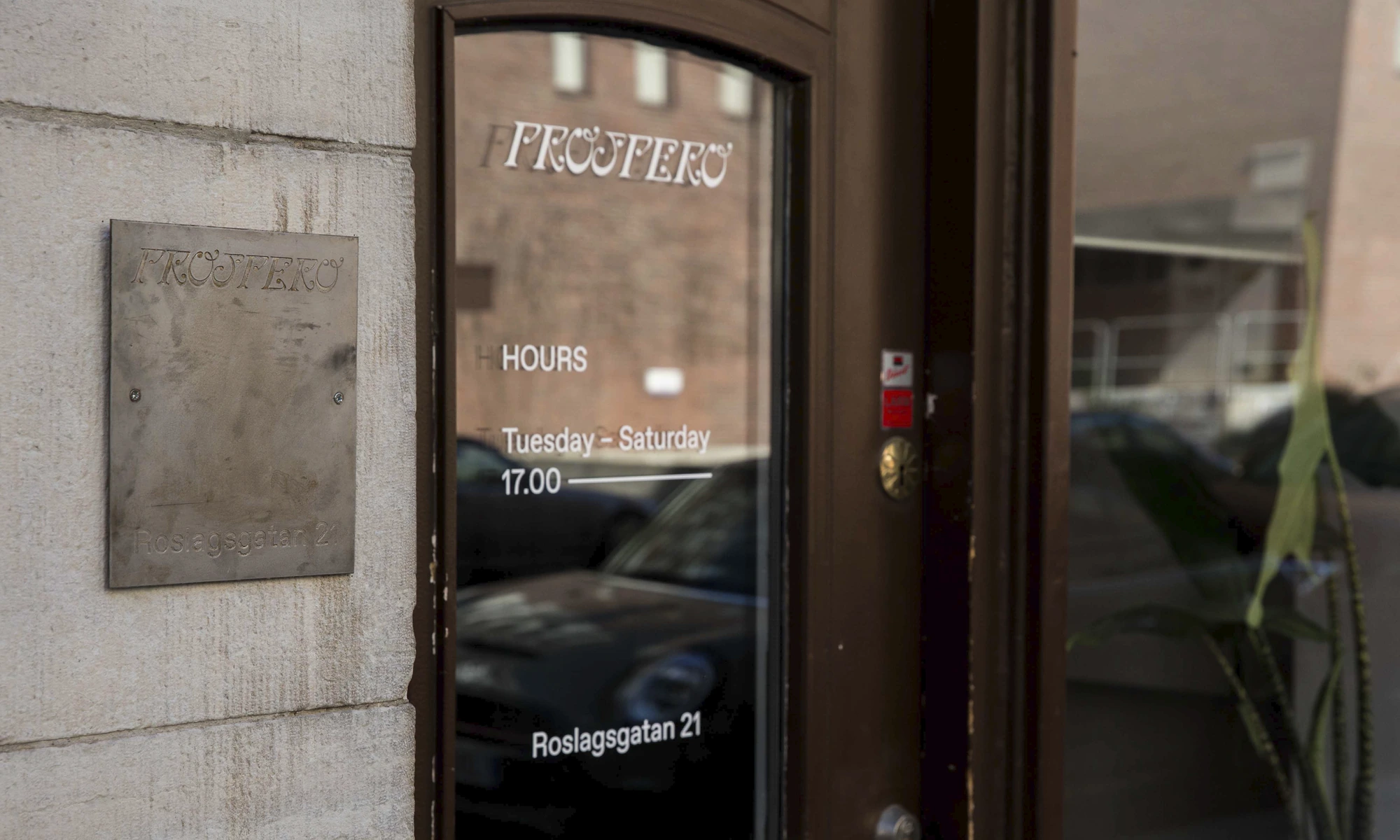
For the restaurant Prospero in Vasastan in Stockholm, we developed a visual identity including logo that was drawn by hand, symbol, and typography. A key part of the project was designing a strict yet flexible menu system a template that allows the restaurant to easily update and print new menus in-house, without the need for additional design work. We defined typefaces, paper choices, and formats to create a solution that is both practical and visually consistent with the identity.
Designed in collaboration with Mikael Hultman
project: visual identity
year: 2019
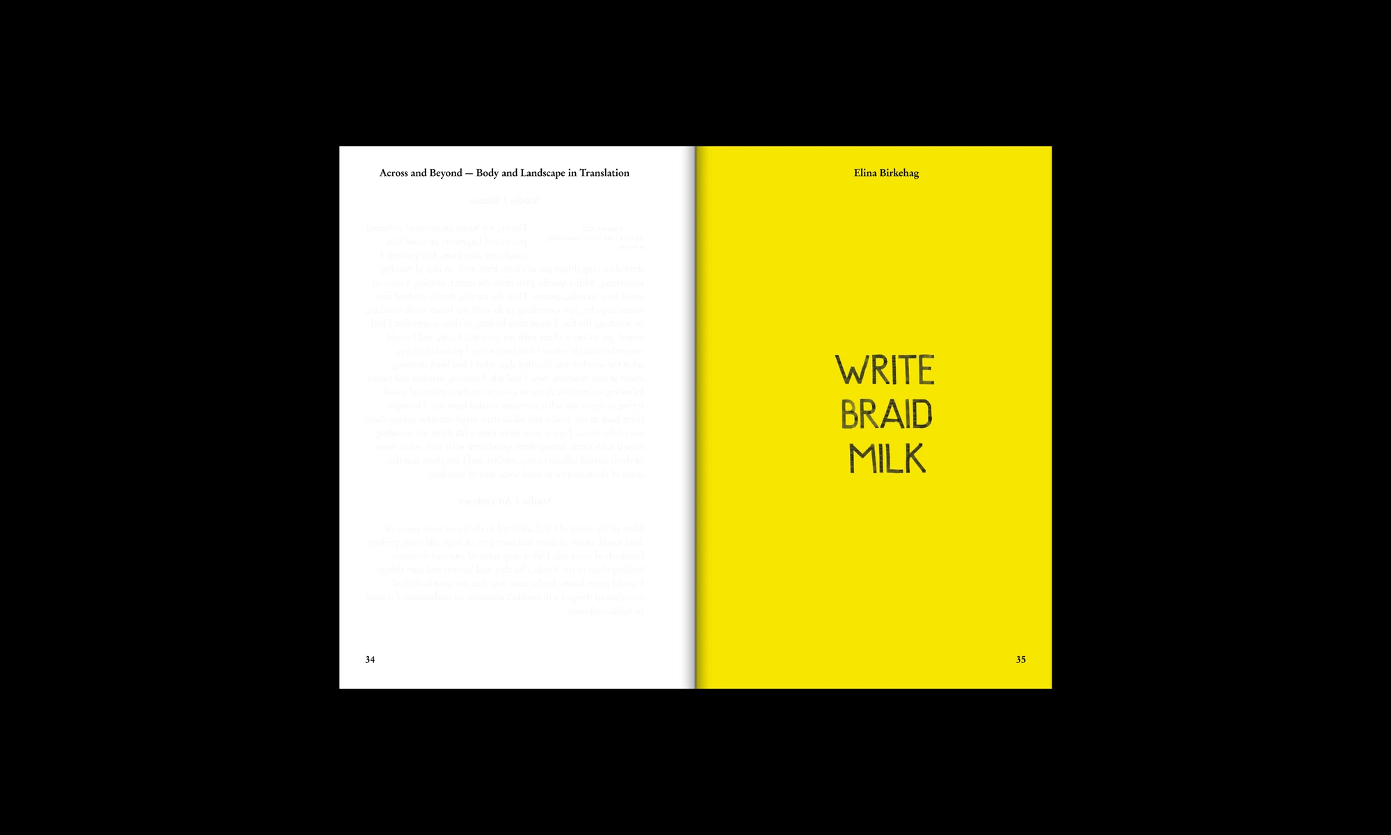
Publication design and visual communication for Across and Beyond: Body and Landscape in Translation. The publication is part of the series Studies in Curating Art and published by the Department of Culture and Aesthetics at Stockholm University. Contributing artists: Axel Gagge, Diana Agunbiade-Kolawole, Elina Birkehag, Joi Wengström, Karin Keisu & Josse Thuresson, Malin Lin Nordström, Shiva Anoushirvani, Tilda Dalunde, Timimie Märak, tm. Editors: Karolina Aastrup, Paulina Granat, Isabelle Ribe. Editorial board: Robin McGinley, Valentina Sansone.
year: 2022
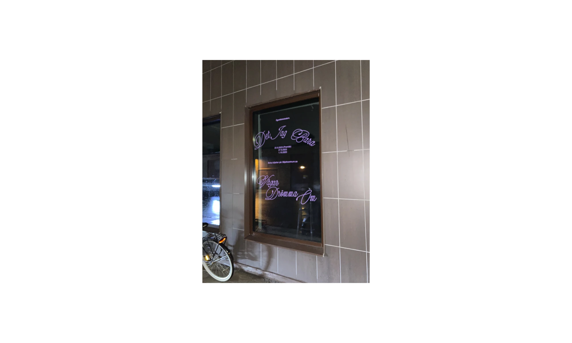
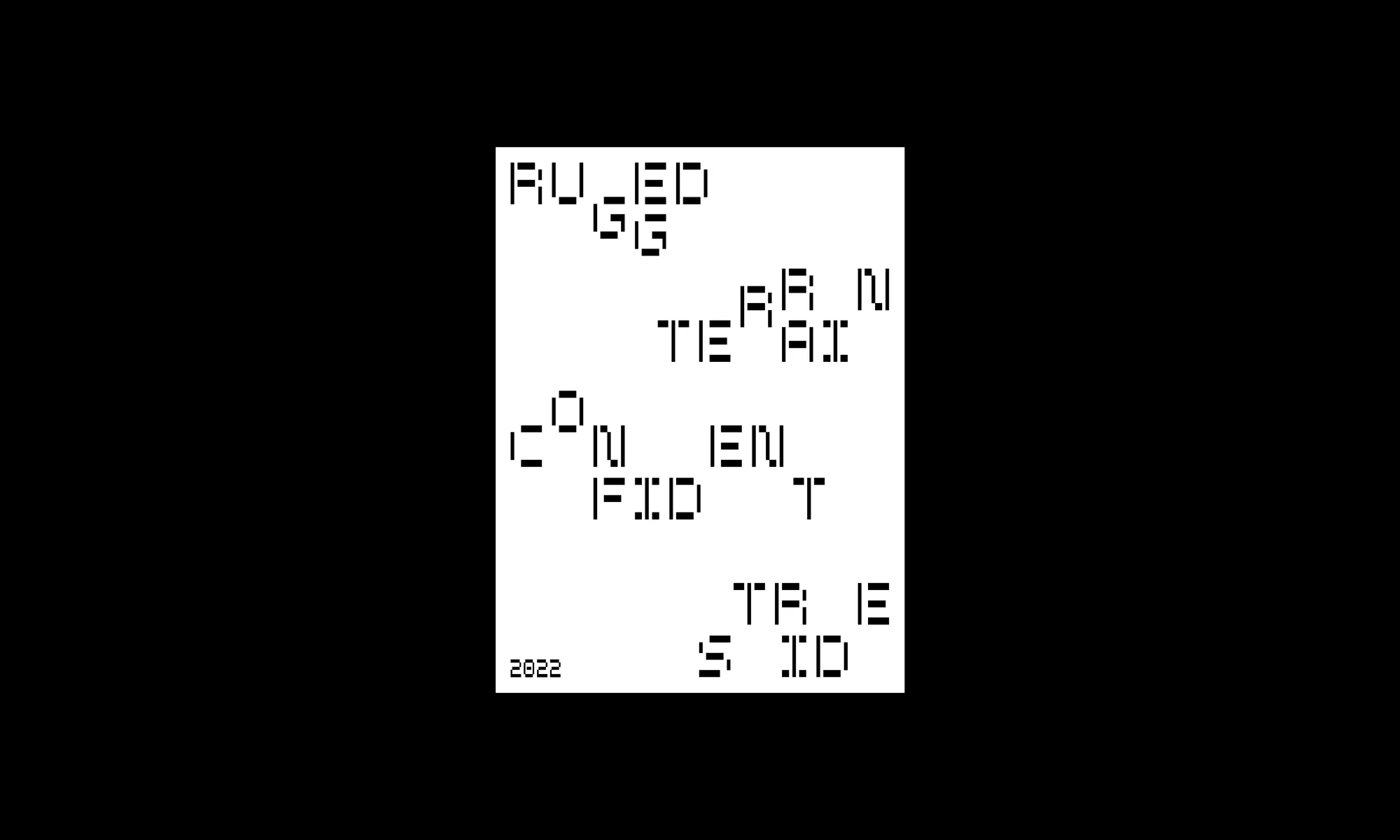
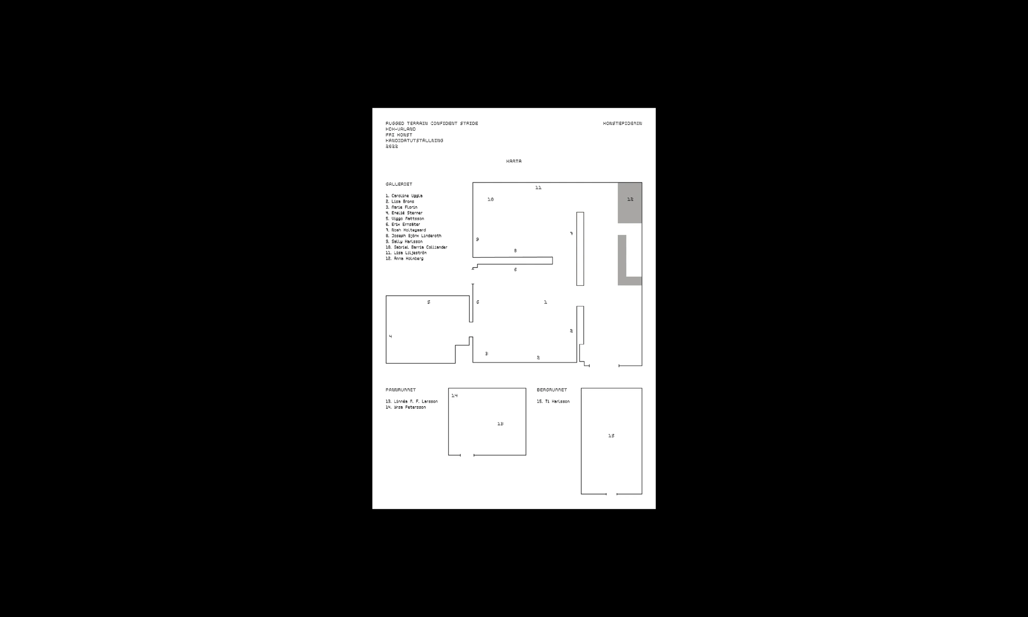
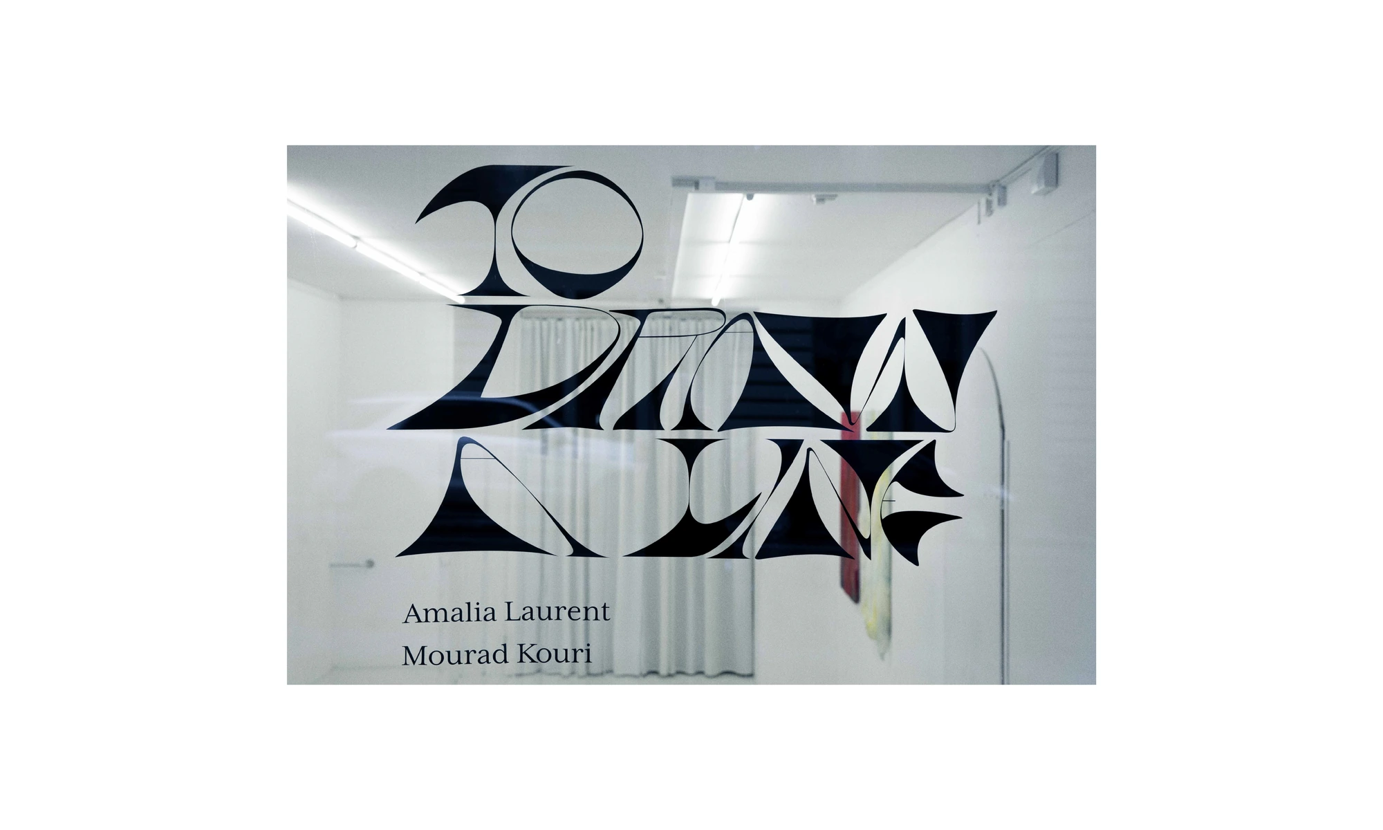
Exhibition identity for Nuda. We designed a window display with bespoke lettering along with a catalogue
Designed in collaboration with Mikael Hultman
Project: Visual identity
year: 2019
Photo: Frida Vega Salomonsson
